Information Aesthetics
Found a website that has a great variety of data
visualization. The website update continuously and have a very stunning visual
and interesting information.
Here's some examples
How Obama Won: Showing the Electoral Shifts through Visual Animation
Explore the Words Spoken at the Republican Convention
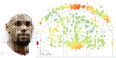
Exploding NBA Basketball Shot Heat Map Analysis
Fat or Fiction: Nutritional Values Depicted as Food Based Infographics
The Historical Evolution of Europe's Borders
By Tongtach Tupavong


No comments:
Post a Comment